


STILL
Helping women feel seen during menopause.
What this work shows: I can turn customer insight into a brand, a product, and an end-to-end experience.
Role: Brand Experience Designer
Responsibilities: Brand Strategy • Consumer Product Design • Packaging • E-commerce • Digital Marketing • Creative Direction
Outcomes:
Founded and grew an online community to 10,000+ women
Created 2 commercial products
Sold through 2 distribution channels: Amazon and Shopify
-
More than 30 million Gen X women are navigating menopause or perimenopause in the United States. To address this emerging market, I led the end-to-end development of STILL Menopause Solutions. I financed, sourced, designed, and launched the menopause supplement brand from concept to market.
-
Many women entered this stage of life without a clear understanding of what to expect and found existing resources and products to be dismissive, impersonal, or not reflective of their lived experiences.
Qualitative research within an online community of more than 10,000 women experiencing menopause revealed a consistent pattern: Menopause is a tangle of frightening symptoms that leave many women reeling with anxiety. Commercial products often communicate clinically or generically, leaving women feeling overlooked and uncertain.
Over 6 months of research taught me that their 3 main pain points are:
Hot Flashes
Anxiety
Sleep Disturbance
Rather than focusing solely on symptoms, the goal was to help women feel informed, understood, and confident in their choices and offer solutions to their most difficult challenges.
-
Women weren't looking for another supplement. They were looking for someone who understood them.
Research revealed that menopause is as much an emotional experience as a physical one. Women consistently described feeling misunderstood by partners, dismissed by healthcare providers, and overlooked by society, leaving them searching for reassurance as much as symptom relief.
While hot flashes were the most frequently reported concern, the symptoms with the greatest opportunity for meaningful improvement were
Anxiety
Sleep Disturbance
Because no supplement can eliminate every symptom, the product strategy focused on addressing the needs I could solve while creating a brand experience that helped women feel seen, understood, and supported.
-
One Need. Two Solutions.
I originally set out to create a THC-based supplement for menopause, believing THC could offer the differentiated experience women were looking for. But product development revealed a critical constraint I hadn't considered early enough: THC dramatically limited where and how the product could be sold, including Amazon.
Rather than abandon the opportunity, I adapted the product strategy. I developed a second, non-THC formula that addressed the same customer needs while opening access to mainstream e-commerce channels.
The result was two approaches to the same problem: one prioritized the product experience I believed in most; the other prioritized accessibility and distribution.
-
Objectives:
Earn Trust
Create a Clear Roadmap
Build Confidence
Encourage Consistency
Rather than treating branding, packaging, and ecommerce as separate deliverables, every touchpoint was designed to reinforce a consistent customer experience.
Four principles guided the work:
01 | Trust through transparency and credibility,
02 | Clarity through accessible education and intuitive communication,
03 | Confidence by empowering women to make informed decisions, and
04 | Consistency by delivering the same supportive experience across every interaction with the brand.
-
Every customer touchpoint was intentionally designed to reinforce trust, reduce uncertainty, and create a cohesive brand experience. Those insights were translated into four core design decisions, codified in the brand guide:
01 — PHOTOGRAPHY
Feature confident, diverse women in their 40s and 50s living full, active lives. Prioritize authentic moments of joy, connection, and vitality over stereotypical portrayals of aging or discomfort.
02 — COLOR PALETTE
Rich, deep purple to communicate confidence, femininity, and sophistication.
Silver accents to reinforce a premium, modern aesthetic.
Warm neutrals to maintain approachability and readability.
Avoid overly bright, clinical, or heavily saturated colors.
03 — TYPOGRAPHY
The Futura typeface conveys confidence, clarity, and modernity. Its clean geometric forms create a contemporary, approachable aesthetic that feels optimistic, premium, and easy to read.
04 — PACKAGING
Soft-touch matte labels, silver foil accents, and glossy black jars reinforce the brand's premium positioning. The combination creates a tactile, sophisticated experience that communicates quality, trust, and modern femininity from the first interaction.
-
My initial two products weren’t the huge success I hoped for. Here’s where I took calculated risks that didn’t pay off.
01 | Calculated Risk: A THC-based menopause product could be the differentiator.
Reality: Regulations and Amazon restrictions created barriers I hadn't fully accounted for.02 | Calculated Risk: Gen X women would readily embrace THC as a menopause solution.
Reality: Changing established attitudes toward THC required considerably more education and trust-building than anticipated.03 | Calculated Risk: A non-THC version would solve the distribution problem.
Reality: It opened Amazon as a viable channel, but the resulting product wasn't the superior solution I wanted STILL to deliver. -
STILL wasn't commercially as successful as I'd hoped, but it fundamentally changed how I approach product design. I learned that customer desirability alone isn't enough; regulatory constraints, distribution, business viability, and customer readiness have to be considered alongside the experience itself. Yet the project transformed six months of customer research into two commercial products, launched across Amazon and Shopify, and a complete brand ecosystem in which every design decision could be traced back to a customer need.
The result was more than a supplement brand. It was an experience designed to help women feel seen.
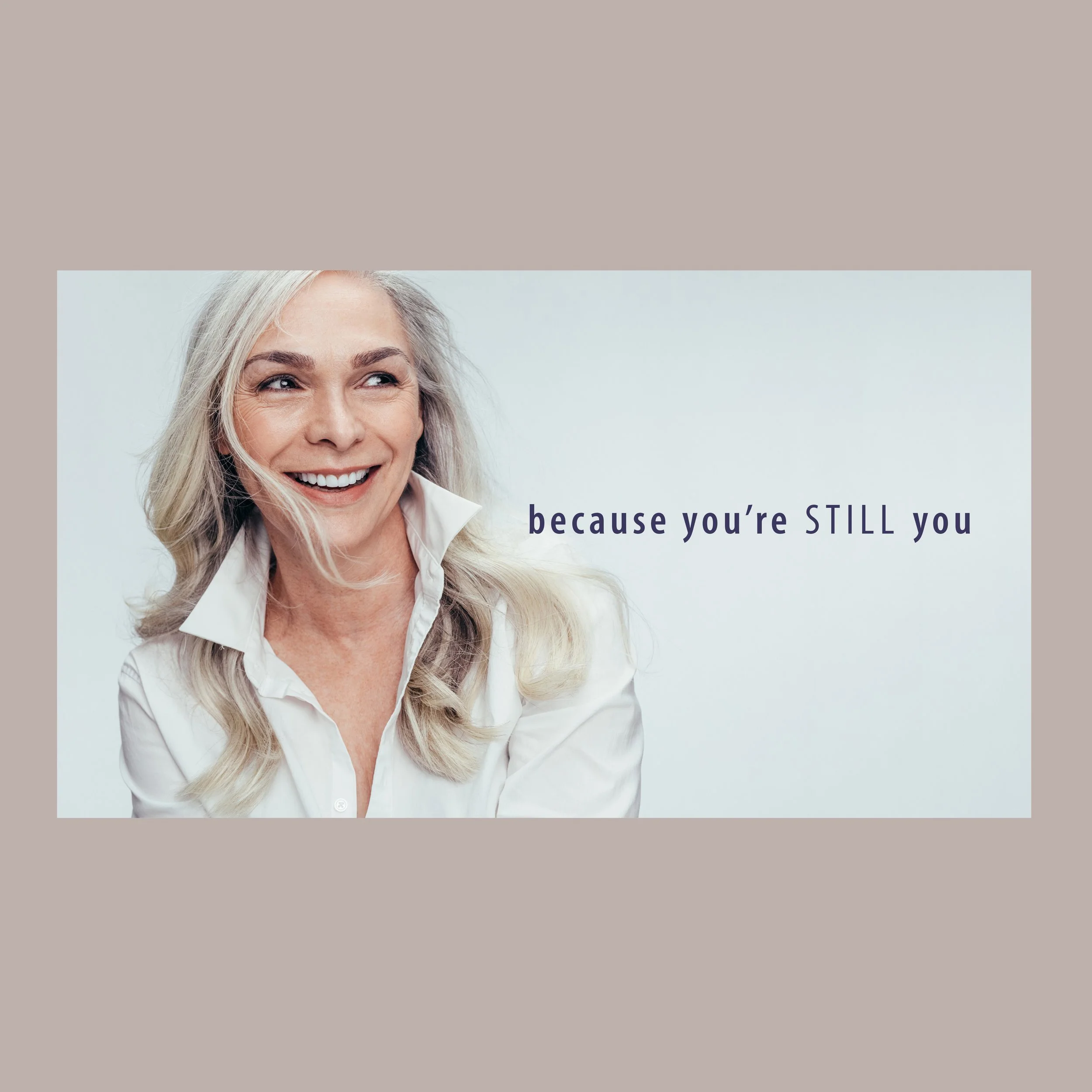
Facebook Banner
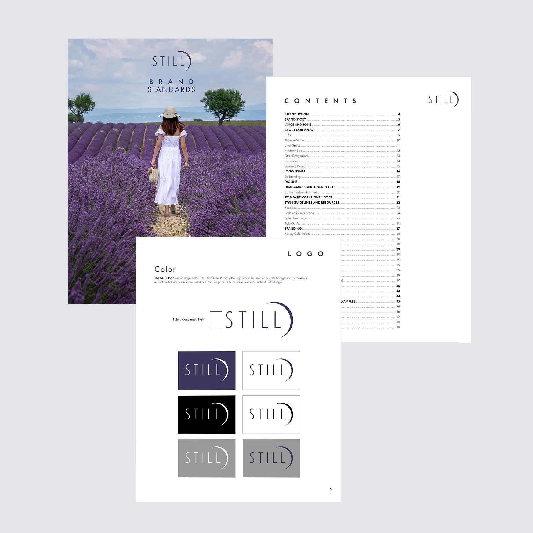
STILL Brand Guide
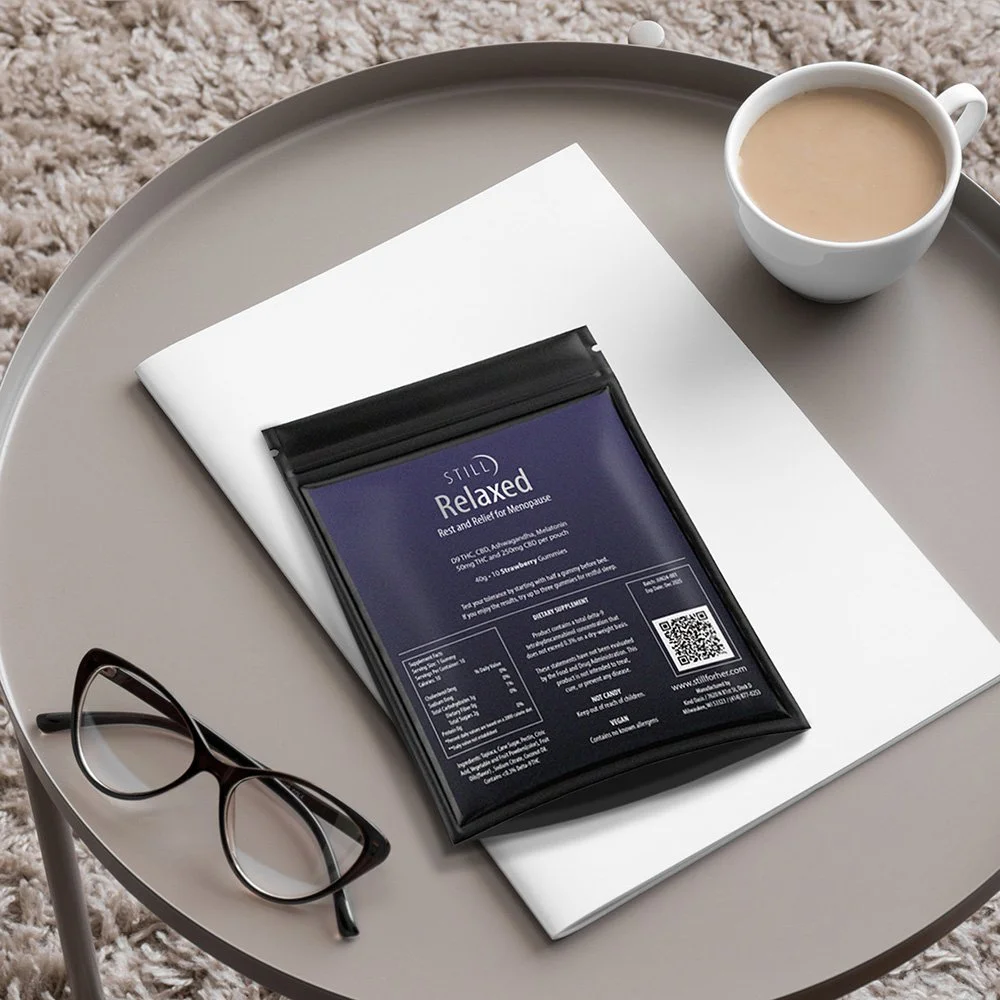
Trial Size Pouch Lifestyle Photography
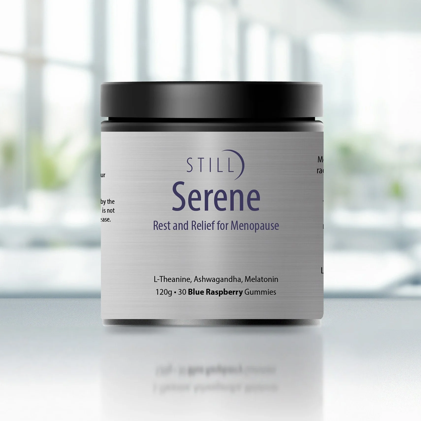
Final STILL Serene Packaging
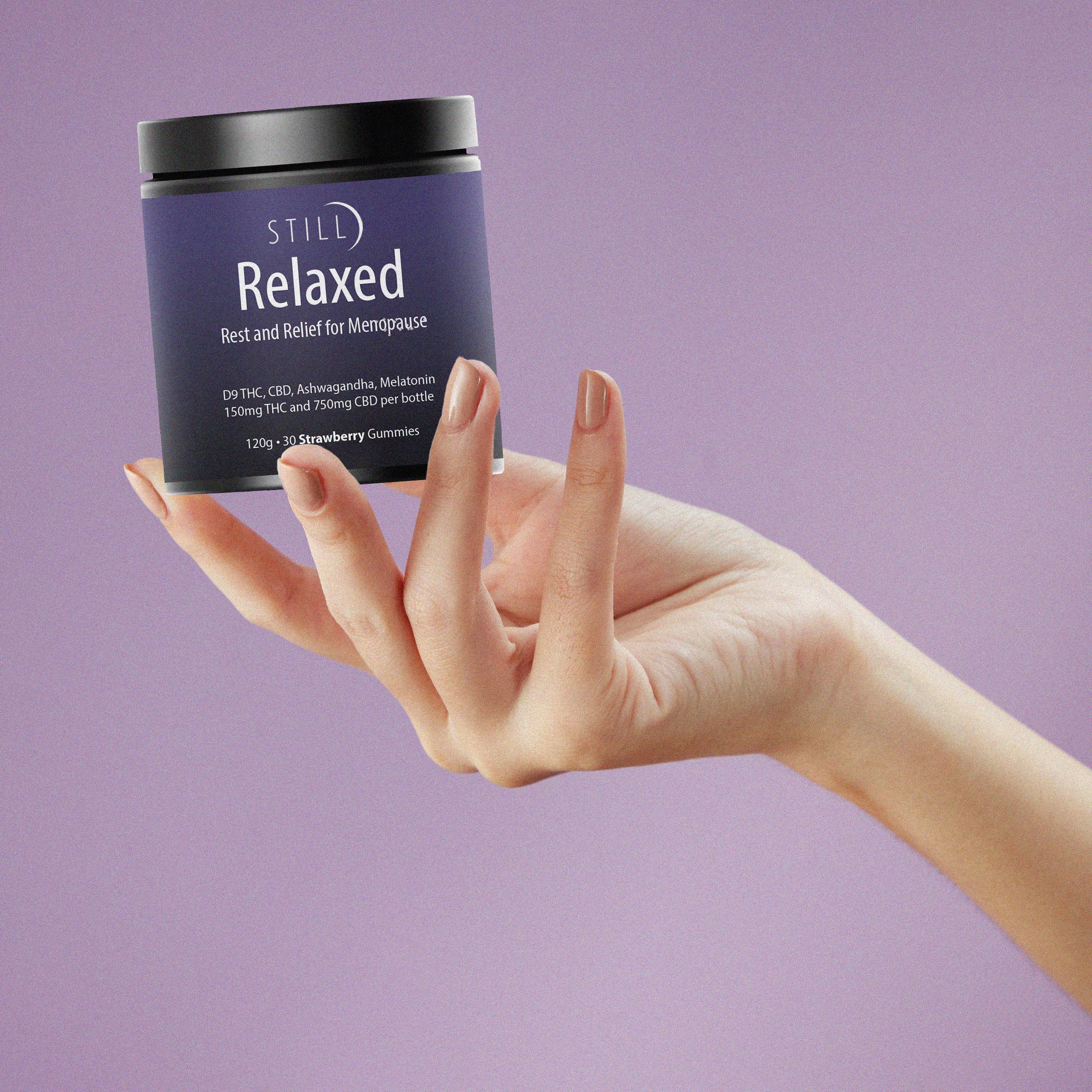
Final STILL Relaxed Packaging
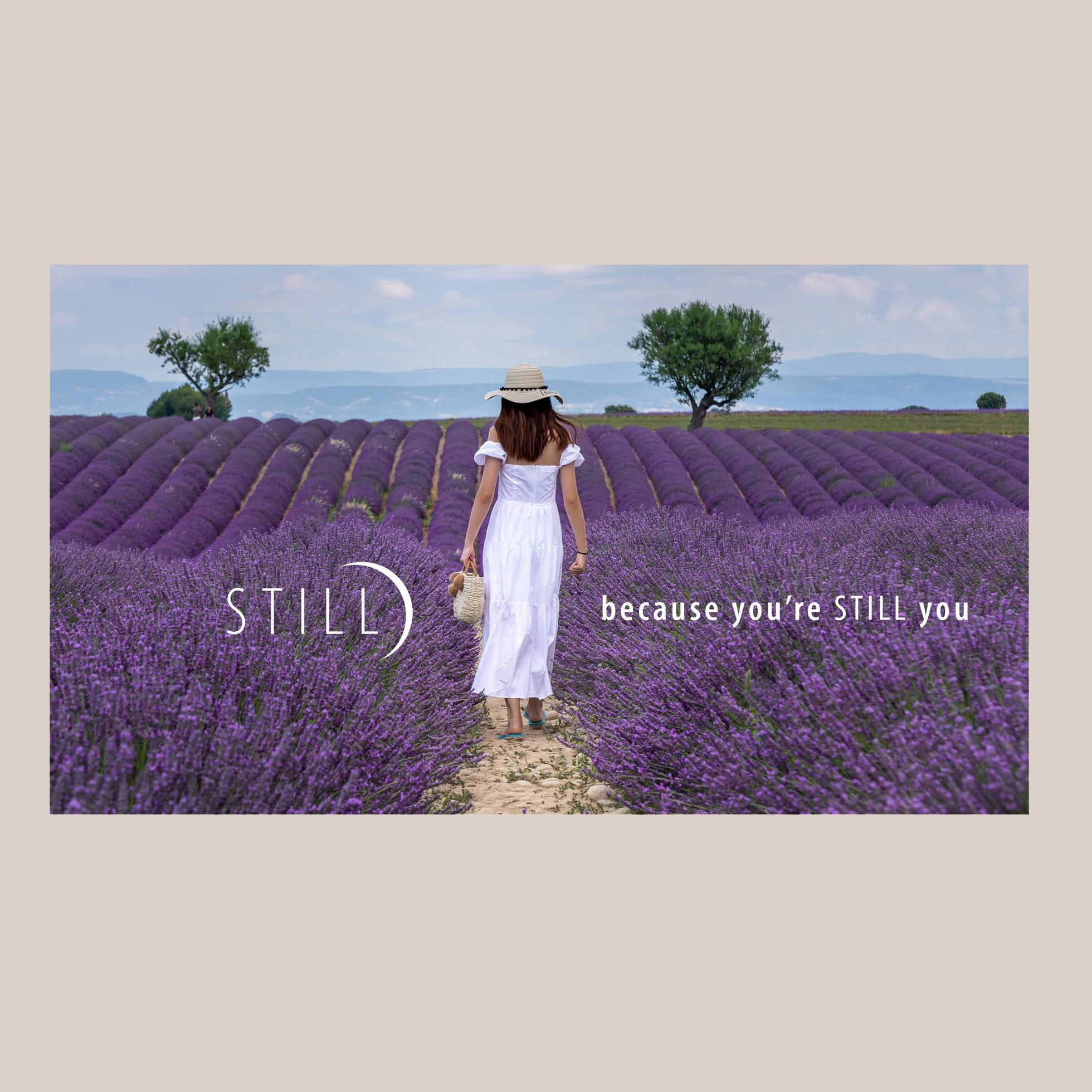
Shopify Banner
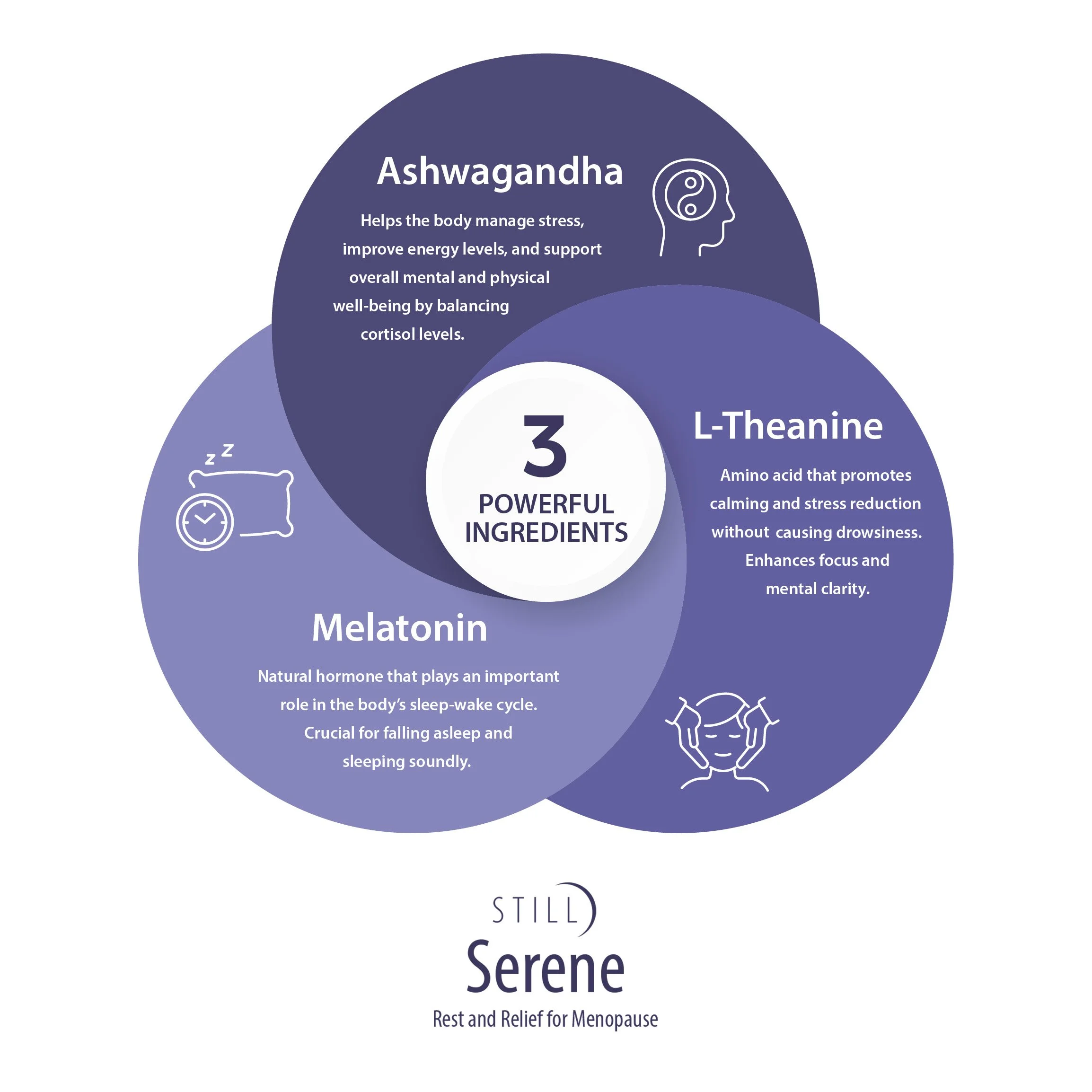
Serene Amazon Product Image
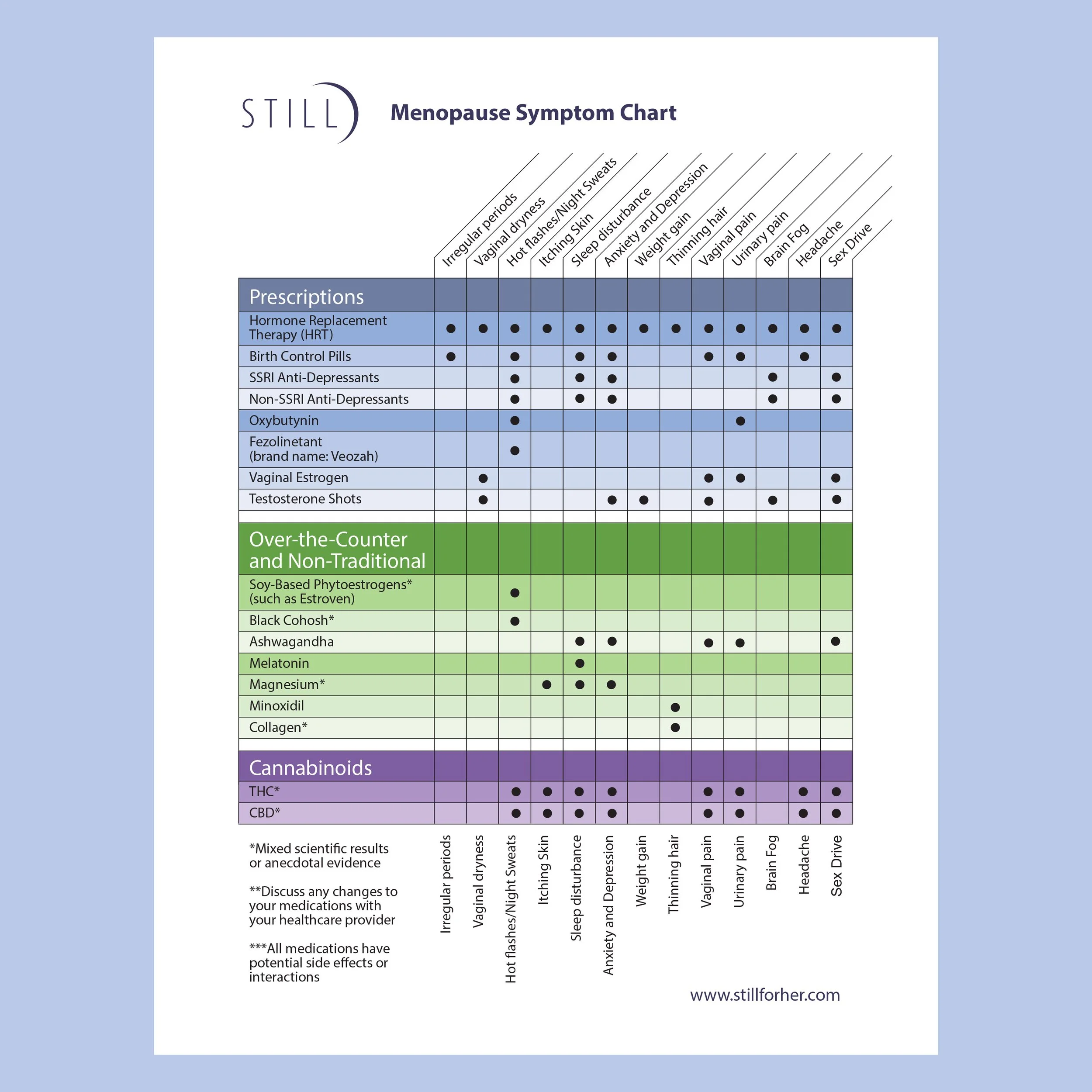
STILL Infographic