

Institute of Internal Auditors
Helping internal auditors feel supported for success
What this work shows: I can work within an established brand and create effective experiences across audiences, channels, and constraints.
Role: Senior Graphic Design Specialist
Responsibilities: Print and Media Design • Print Management • Digital Marketing • Creative Direction
260K+ global members reached
50+ technical and educational projects annually
14 conferences and events supported annually
114 countries represented at the International Conference
-
With over 260,000 members worldwide, the IIA is an established global brand with an enormous range of content, audiences, and touchpoints. My challenge is to work within that existing system while adapting it to very different needs, from dense technical research and certification campaigns to international conferences and environmental graphics.
Each project requires finding the right balance between brand consistency, clarity, and visual impact, often translating complex information into something people can quickly understand and act on.
For the member on the other side of that complexity, the experience needs to feel simple: clear information, an obvious next step, and confidence that the IIA can help them move forward.
-
To be successful in my current in-house marketing role, I work to:
01 | Make Complexity Feel Simple
I work with technical research, educational content, and complex subject matter that can easily become overwhelming. I focus on hierarchy, pacing, and visual storytelling to help people quickly understand what matters without oversimplifying the information. The goal is to move the audience from overwhelmed by information to confident about what matters next.
02 | Find Freedom Within the System
I didn't create the IIA brand; my job is to make it work. I look for opportunities within established guidelines to keep the work fresh and engaging while maintaining consistency across very different audiences, campaigns, and channels.
03 | Design for Where It Lives
I design with the final experience in mind. A report, webpage, catalog, conference sign, and 20-foot environmental graphic can't be approached the same way. I consider scale, viewing distance, context, production, and how people will actually interact with the work, not just how it looks on my screen.
04 | Think Globally
Designing for an international organization means creating work that can travel. I consider how layouts will accommodate translation, how imagery and messaging will resonate across audiences, and how designs will adapt across markets and formats. The goal is to create experiences that feel consistent and clear, wherever they're encountered.
-
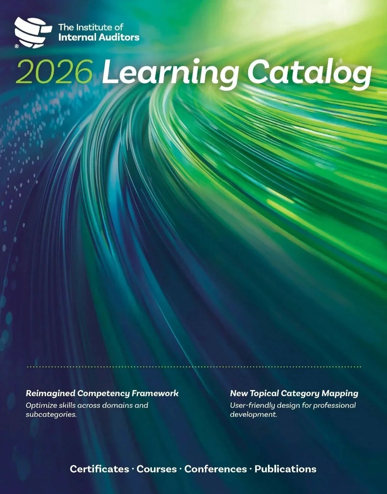
These principles come together in projects like IIA's Learning Catalog. With an established brand system and a defined business objective, my job wasn't to reinvent the identity—it was to explore how far I could push the creative while remaining unmistakably IIA.
The assignment: Create a new cover for the annual Learning Catalog that felt fresh and engaging while working within IIA's established visual identity.
Click HERE to see the evolution of the 2026 IIA Learning Catalog.
-
Good design doesn't just communicate information. It helps move people from how they feel now to how they need to feel next.
Working with IIA's lead copywriter, I helped conduct and analyze hundreds of Voice of the Customer surveys, looking beyond what members said they wanted to uncover the emotions underneath: uncertainty, pressure, ambition, frustration, and the desire to feel prepared for what's ahead.
We use those insights as a filter for creative decisions. Before asking what a campaign should look like, we can ask: How does our audience feel now? How do we want them to feel? What will help move them there?
The research has created a growing library of customer insight that can inform campaigns for years, helping us design not just around what members need to know, but how they need to feel in order to take the next step.
-
My work at The IIA operates at a truly global scale. I design across 6+ revenue and engagement channels, support 14 annual conferences and events, and help transform 50+ technical reports, research pieces, and educational campaigns each year into accessible visual communications. My work has contributed to content translated into 30+ languages, catalogs distributed to 260,000+ members, and the 2026 International Conference experience for 2,000+ attendees from 114 countries. Today, The IIA's reach extends to 265,000+ members across 170+ countries and territories, making every design decision part of a much larger global experience.
Behind that scale is the same goal: make a complex global organization feel clear, relevant, and useful to the individual member trying to move forward in their career.
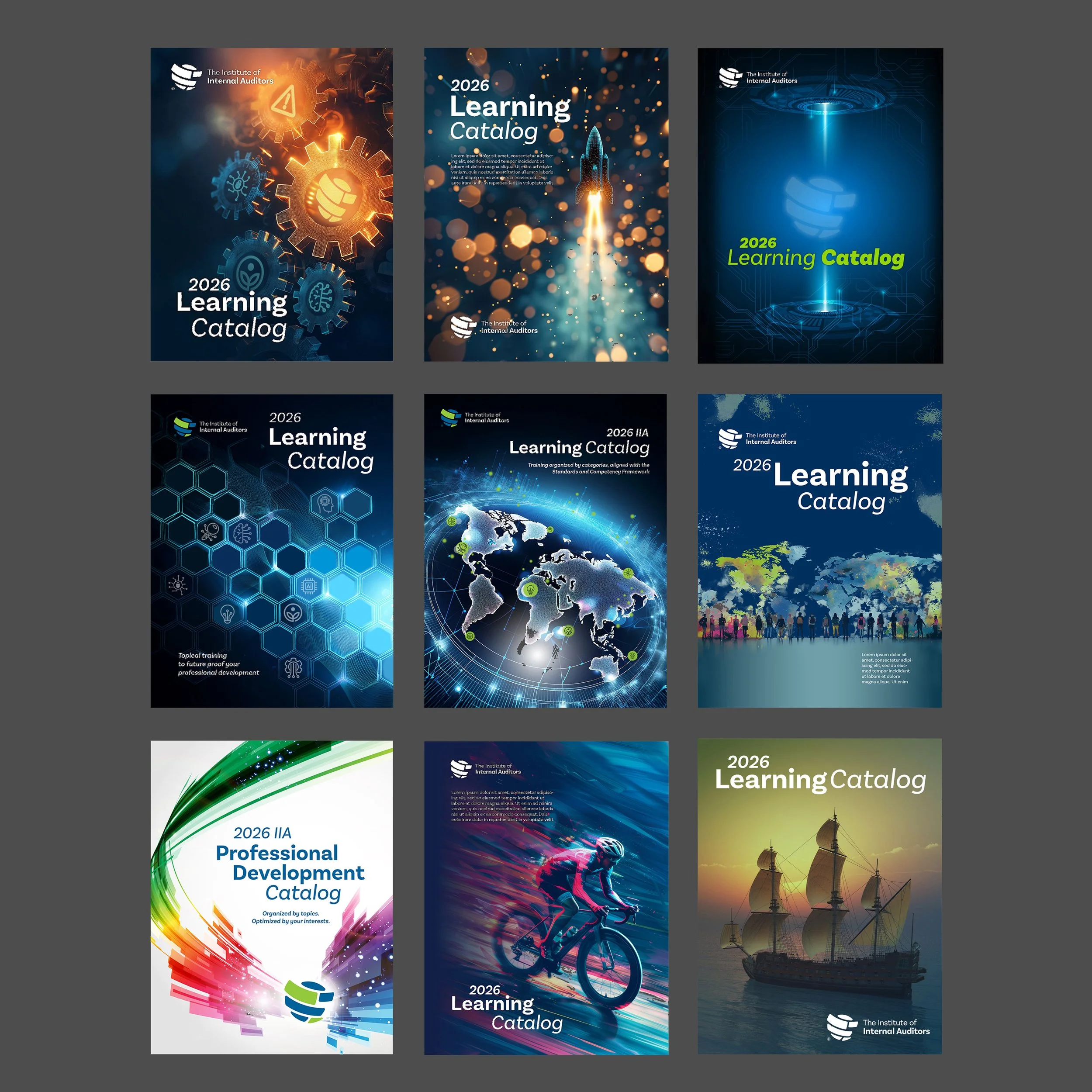
Learning Catalog Cover (Click for Case Study)

Environmental Graphics
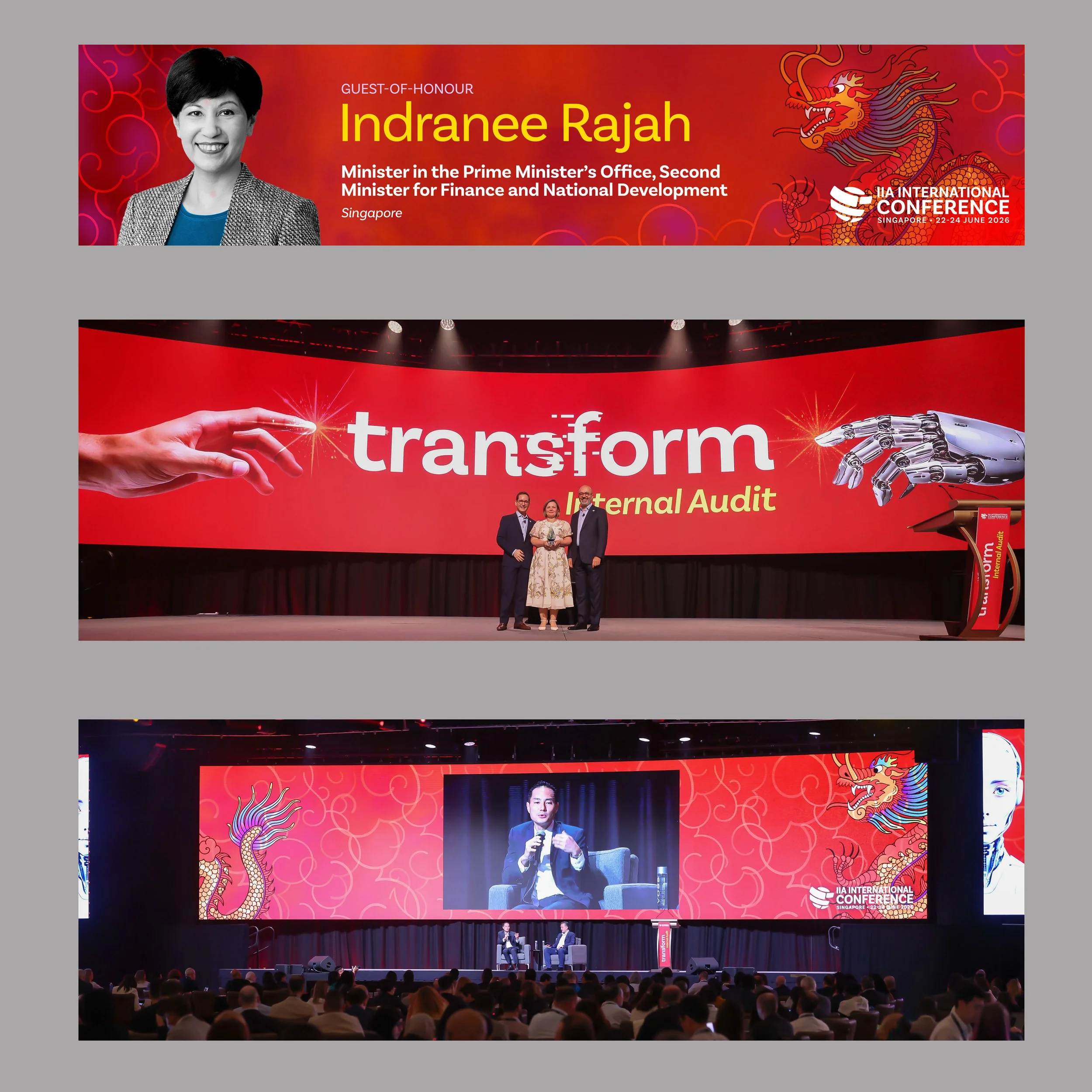
Environmental Graphics
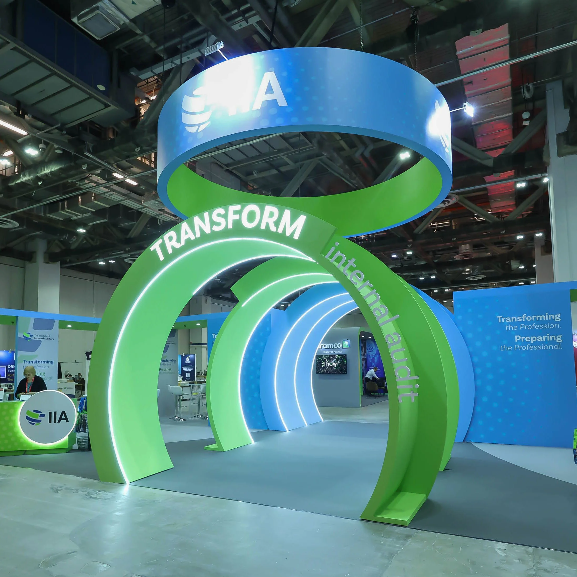
Environmental Graphics

CIA Rebrand Brochure
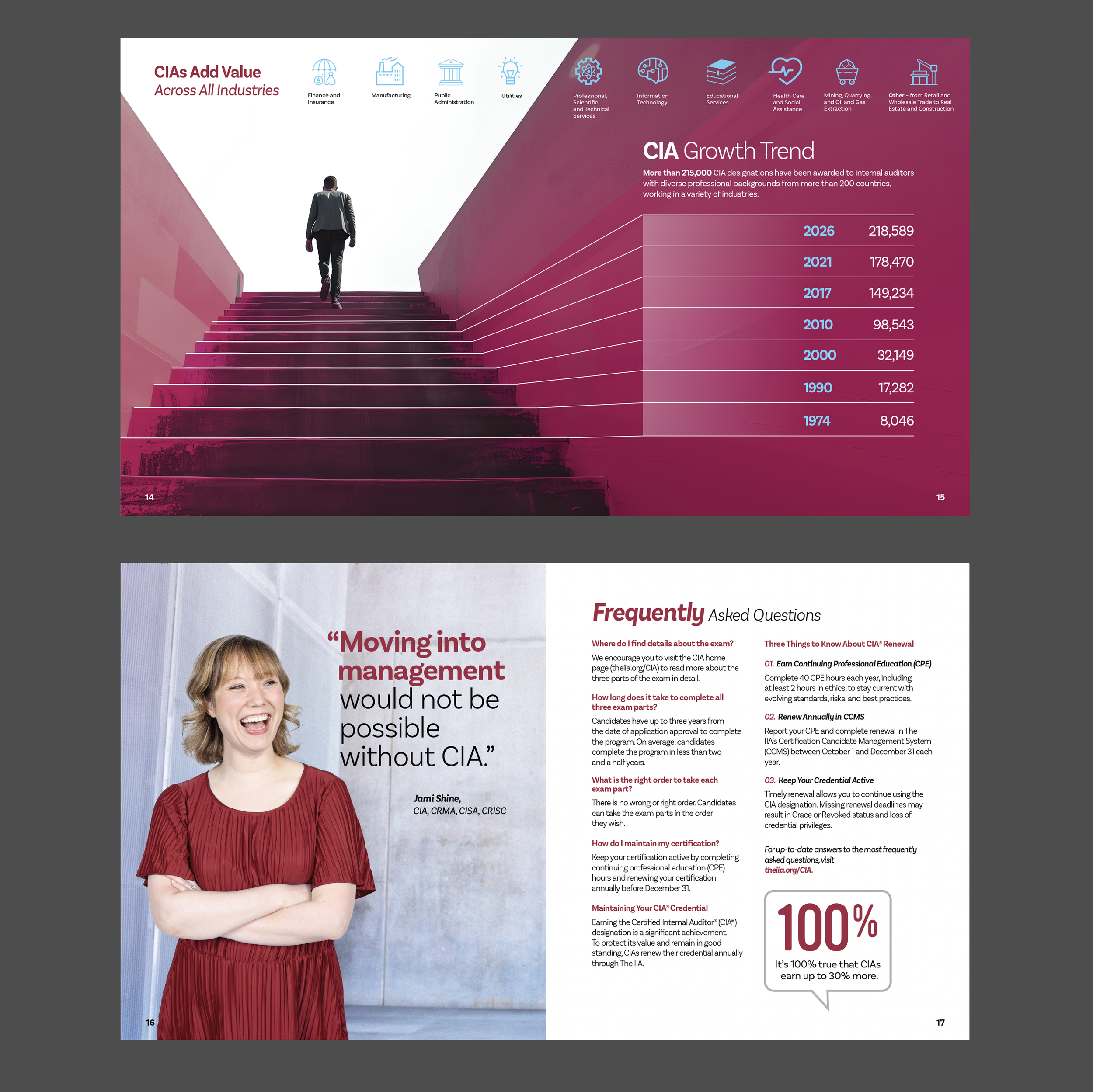
CIA Rebrand Brochure
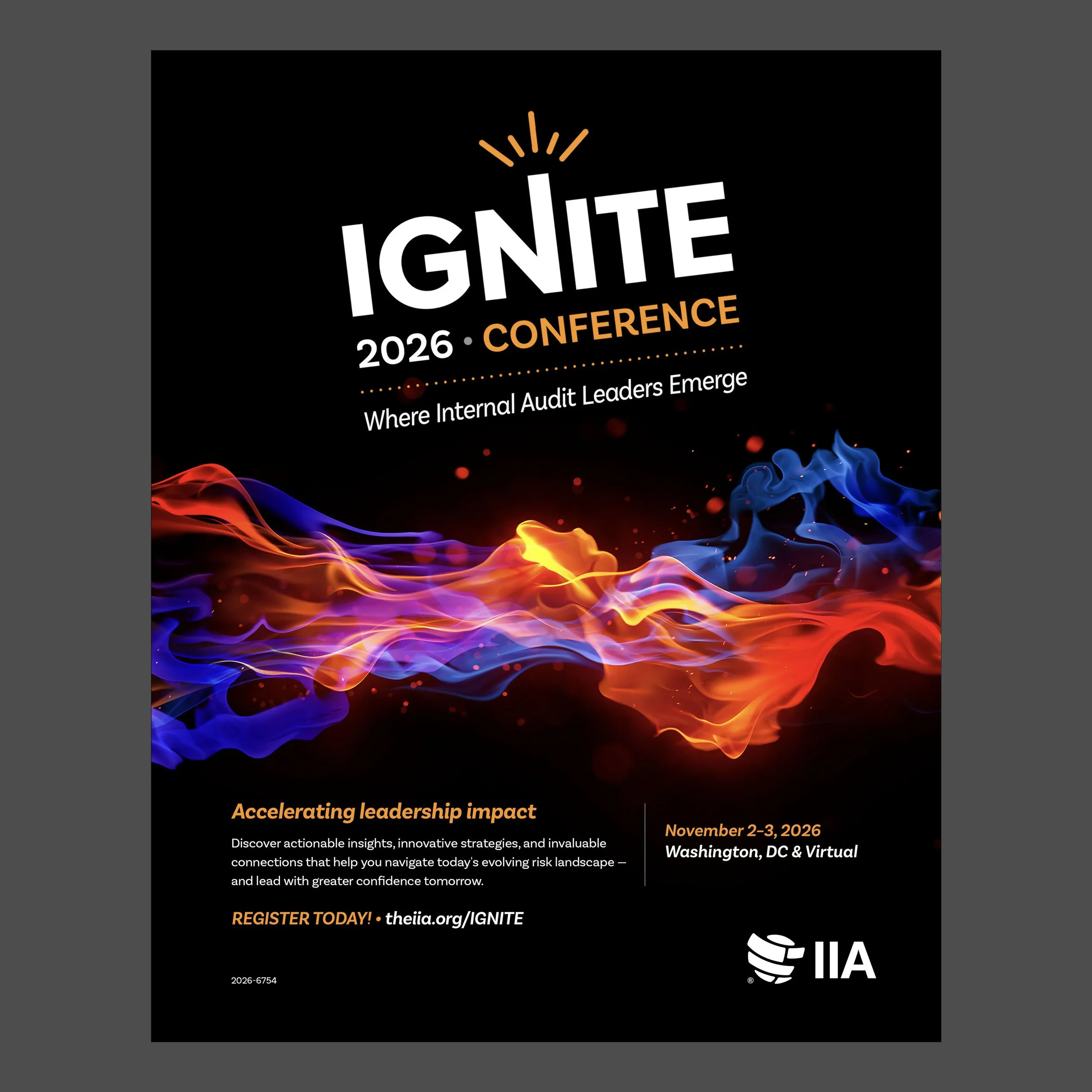
Ignite Magazine Ad

GAM Digital Asset

GAM Environmental Graphic
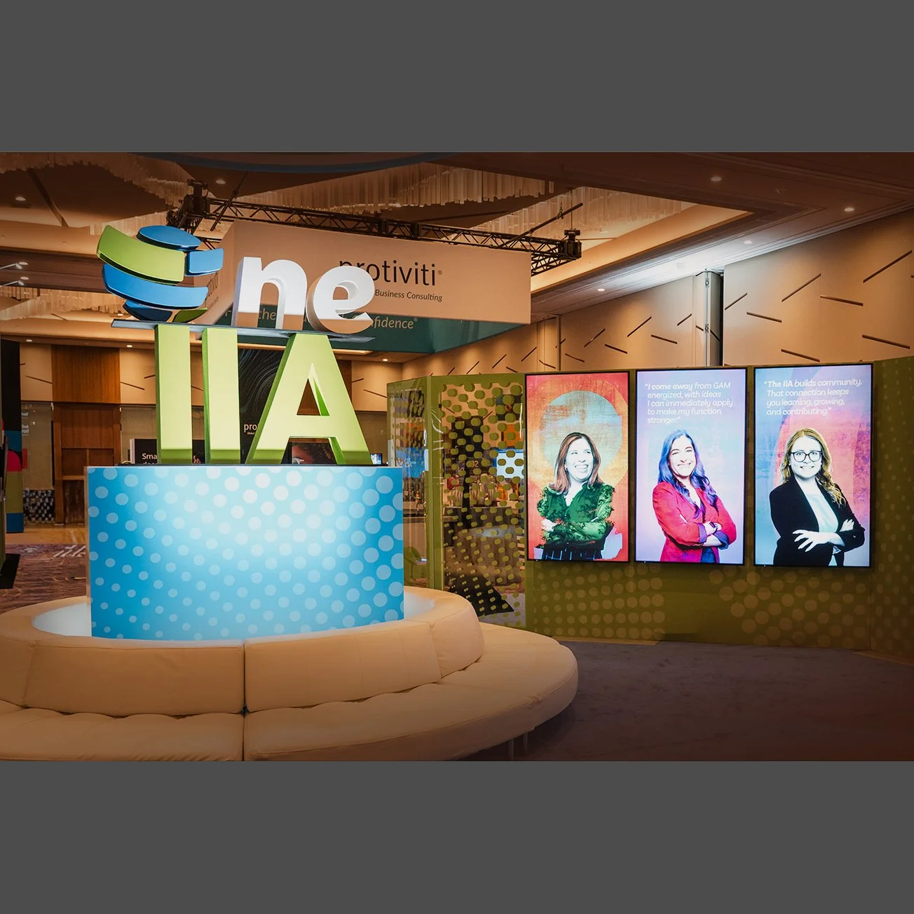
Environmental Graphics
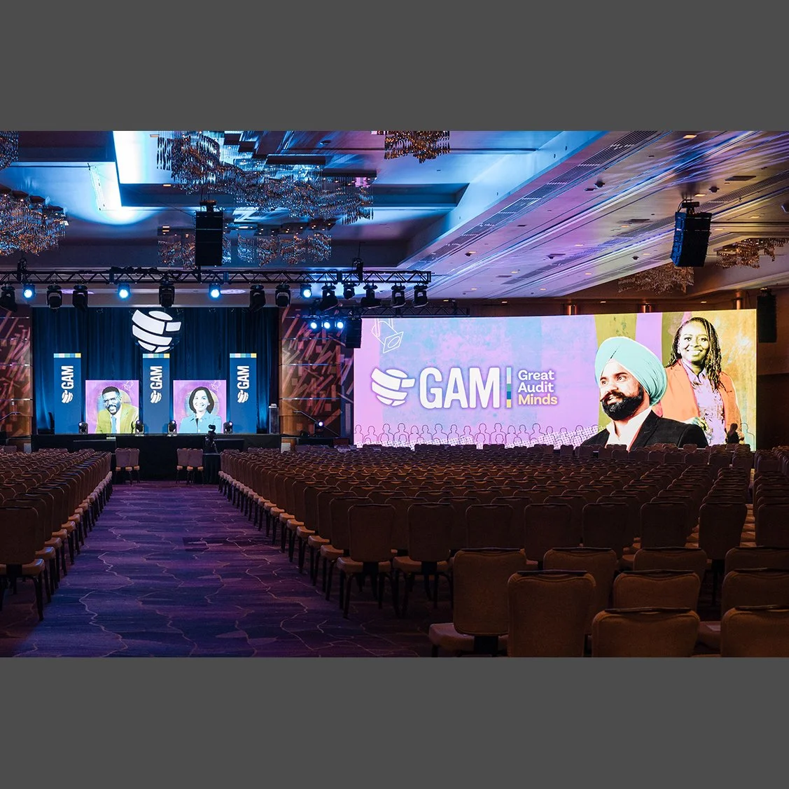
Environmental Graphics
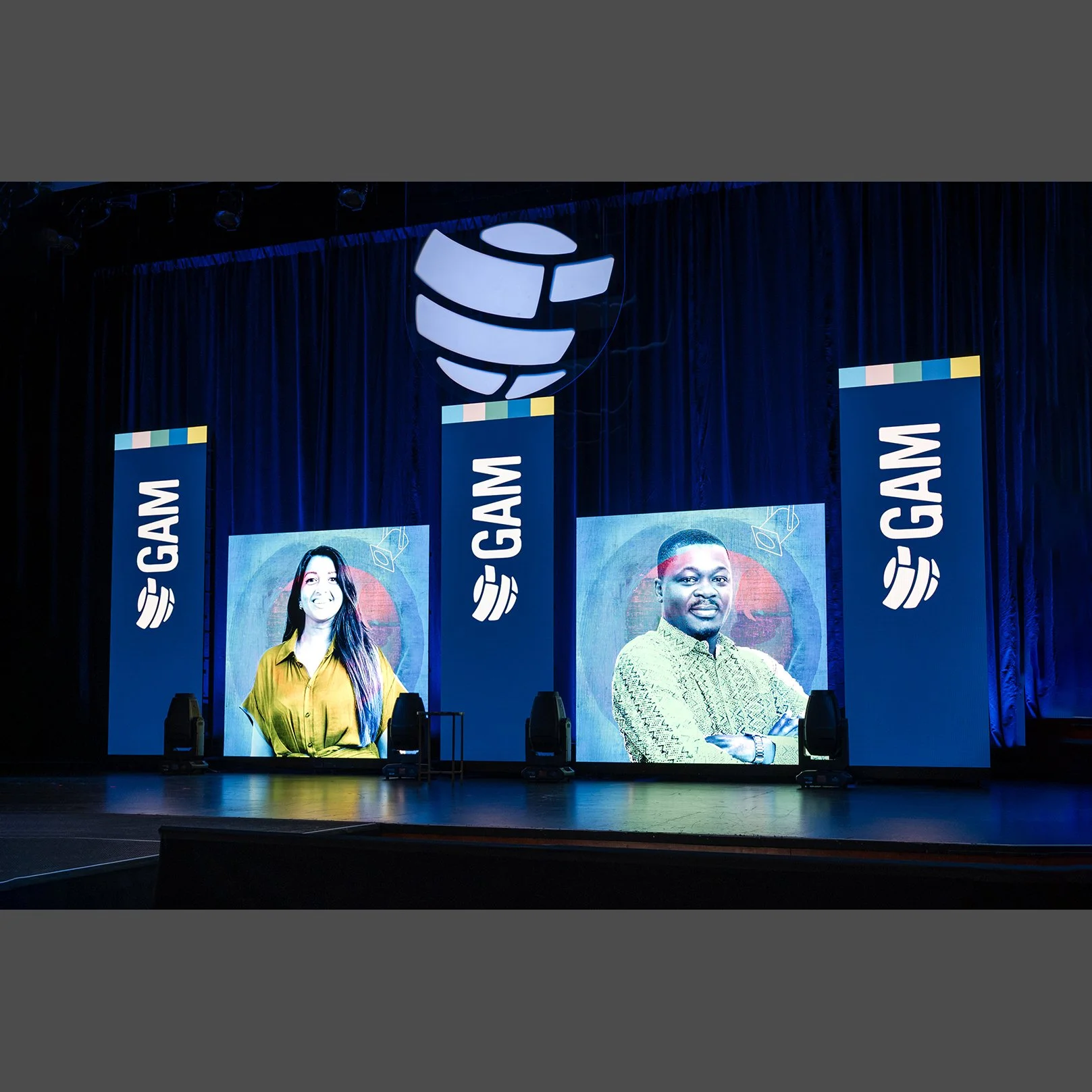
Environmental Graphics