MMAR Medical Group
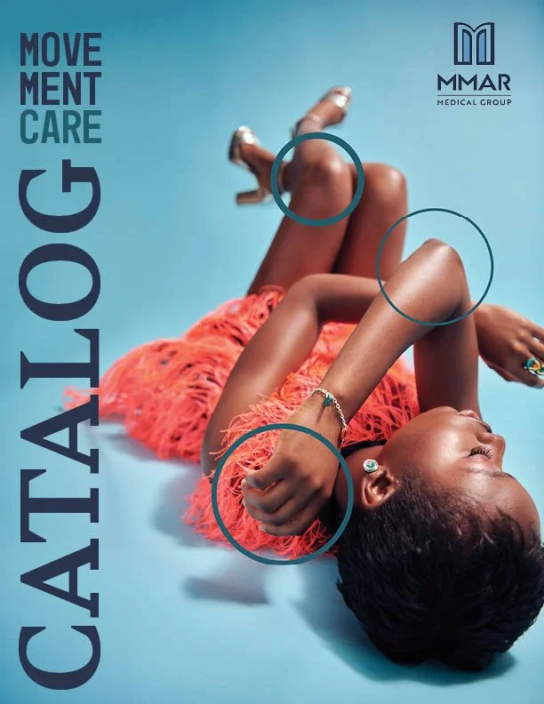
I redesigned the MMAR Medical catalog twice in the early 2000s, modernizing its visual identity before translating the experience to the web. In 2026, I revisited the brand, incorporating fashion-inspired photography and editorial design to differentiate MMAR from others on the market.
Role: Creative Director | Brand Designer
Responsibilities: Creative Direction | Brand Strategy | Brand Design | Print Management | Print to Digital Transition
The Challenge:
Break Industry Conventions: Differentiate MMAR from competitors whose catalogs relied on cold, clinical imagery and technical aesthetics.
Balance Function and Aspiration: Showcase medical devices clearly while emphasizing the confidence, mobility, and independence they help patients regain.
Elevate Without Sacrificing Usability: Introduce fashion-inspired photography and editorial design while keeping a complex product catalog intuitive and easy to navigate.
Outcomes:
Distinctive Brand Positioning: Transformed a conventional medical catalog into a fashion-inspired editorial experience that stands apart from competitors.
Elevated Product Experience: Created a cohesive visual system that balances aspirational photography with clear product information and intuitive navigation.
Digital Presence: Transitioned the brand to the web in the early 2000s, after 30 years as a printed catalog.
Medical Device Catalog
-
I reimagined the traditional medical device catalog by borrowing from the visual language of fashion and lifestyle magazines. Rather than relying on the cold, clinical or futuristic aesthetic common in the industry, I created an editorial experience built around beautiful photography, aspirational imagery, and sophisticated design. The products remain central, but the focus shifts from the medical device itself to what it makes possible: helping patients return to the active, confident lives they want to lead. The result is a catalog that sells more than medical equipment. It sells the promise of getting back to yourself.
-
Medical device catalogs traditionally focused on function over emotion, relying on clinical product photography, technical specifications, and sterile layouts. While informative, these catalogs did little to differentiate competing brands or connect with the people behind the products. MMAR Medical needed a catalog that could communicate essential product information while standing apart in a crowded, visually predictable marketplace.
The challenge was to reimagine medical equipment through the lens of lifestyle and aspiration. Rather than defining patients by their injuries or limitations, the catalog needed to reflect the lives they wanted to return to—active, confident, and independent. The design had to balance the credibility and clarity expected of a medical supplier with the visual sophistication and emotional appeal of a consumer fashion publication.
-
As a distributor carrying products from multiple medical device manufacturers, MMAR competed not only with other distributors but also with the brands it represented. Across the industry, competitors followed two predictable visual approaches: sterile, clinical design dominated by white backgrounds and utilitarian product photography, or sports-focused imagery emphasizing athletic performance, injury, and recovery.
Both approaches communicated product functionality, but neither offered much emotional differentiation. With many competitors selling the same or similar products, MMAR needed to stand out through the experience of its brand rather than the products alone. This created an opportunity to borrow from fashion and lifestyle publications, using aspirational photography and sophisticated editorial design to position MMAR as something more than another medical equipment catalog.
-
The original MMAR identity relied on traditional serif typography, metallic gray lettering, and a conventional medical-industry aesthetic. While professional, I felt it lacked the distinctive personality needed to support the brand's new positioning.
I redesigned the identity with clean, geometric typography, a modern blue palette, and a distinctive monogram. I simplified the forms to create a more contemporary, recognizable brand while maintaining the credibility expected of a medical distributor. The result was a visual identity that felt less clinical and more consumer-focused, establishing a foundation for the fashion-inspired catalog and subsequent digital experience.
-
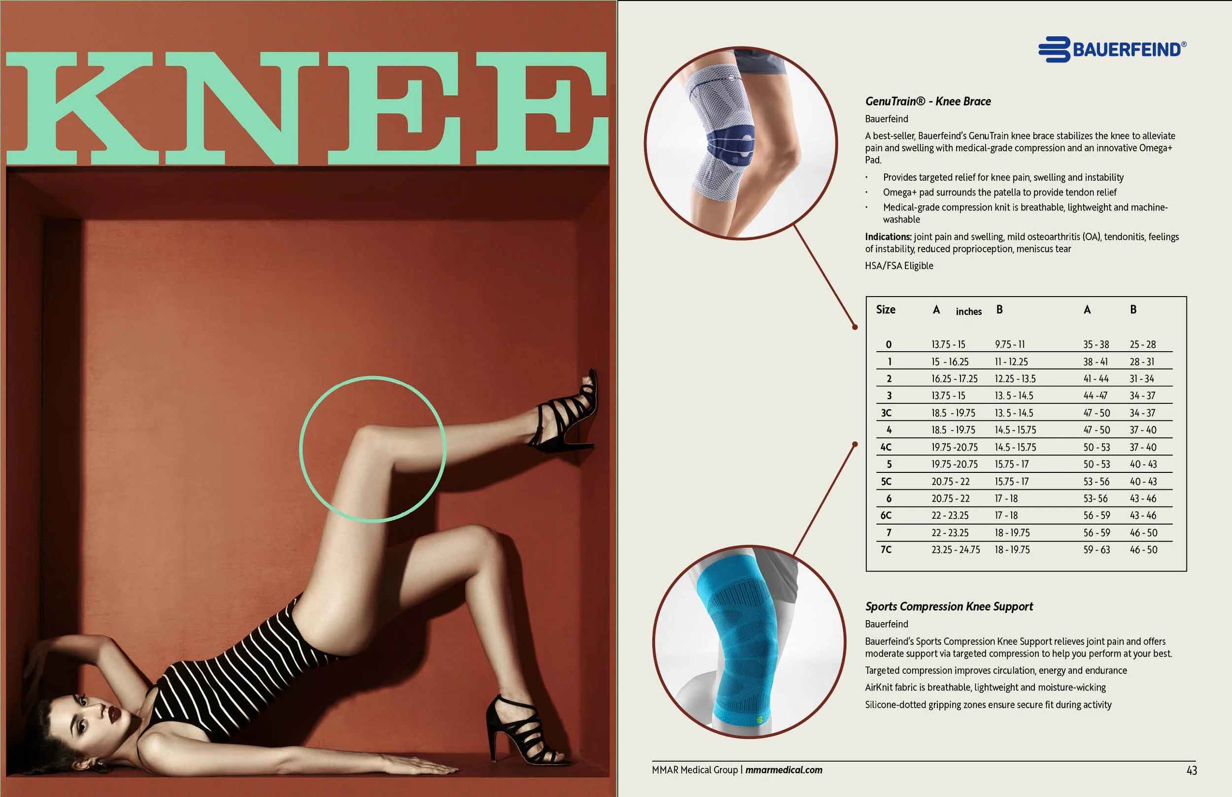
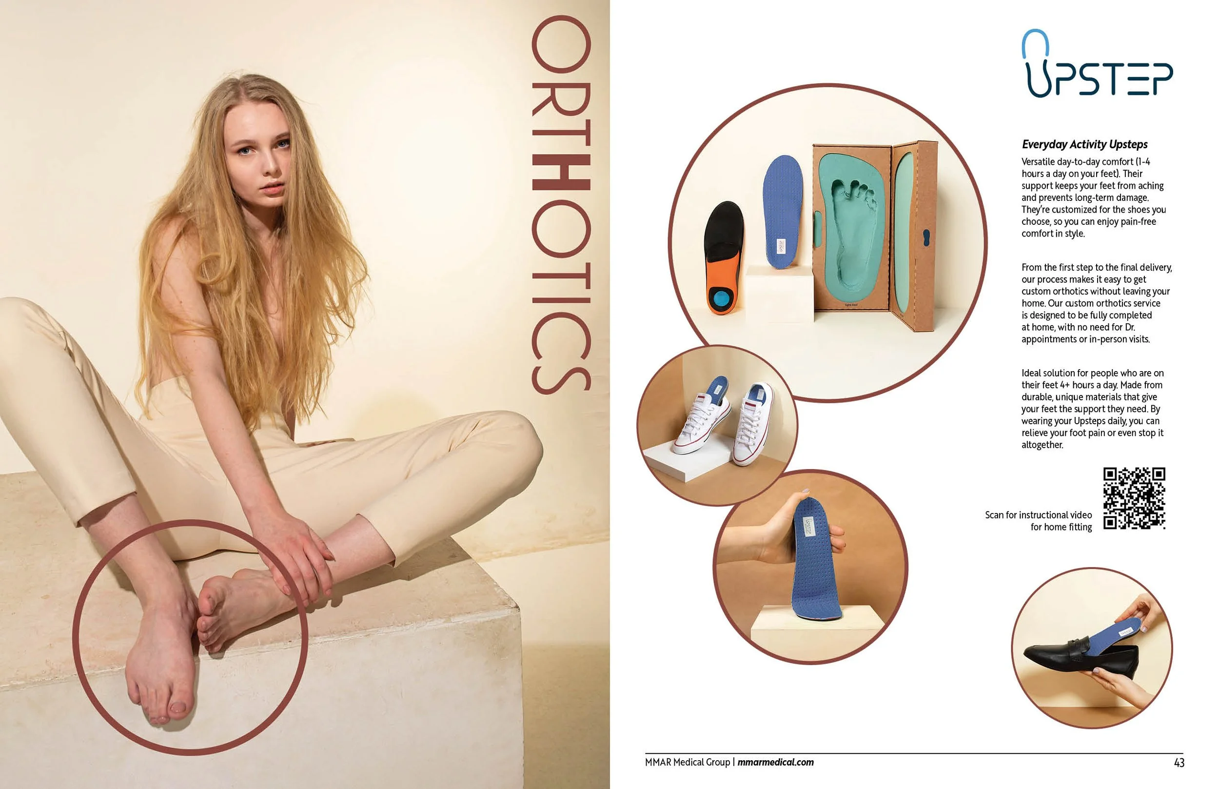
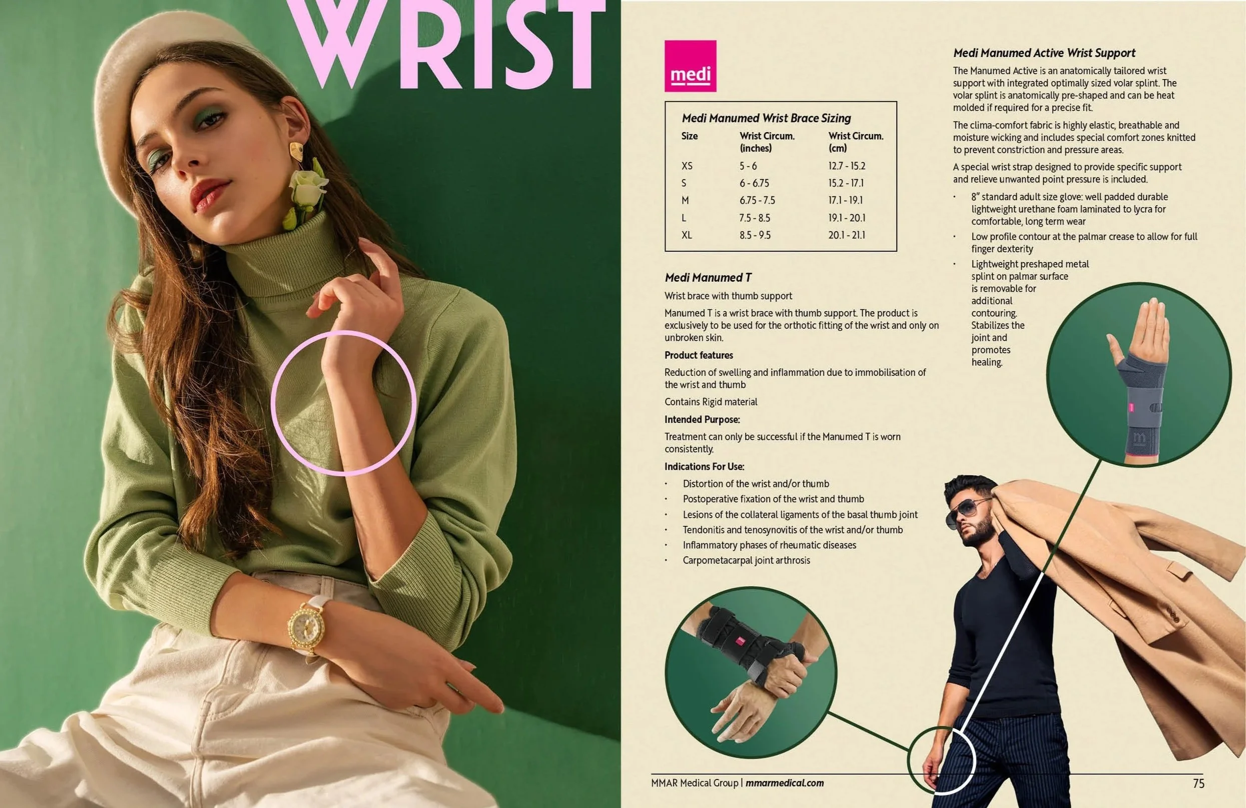
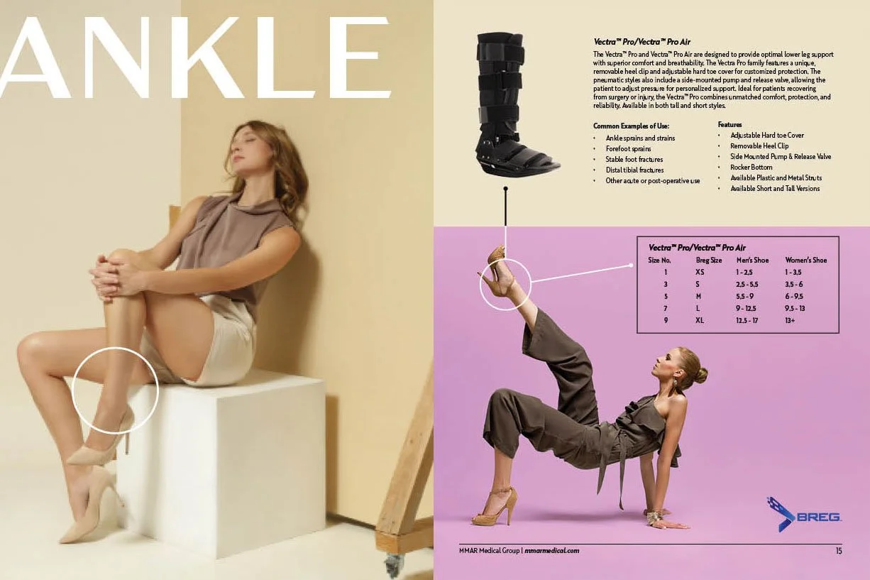
I brought a fashion-editorial sensibility to a category traditionally dominated by clinical imagery and athletic performance. Rather than leading with medical devices, I used aspirational lifestyle photography to establish an emotional connection. I wanted customers to see themselves not as patients defined by injury or physical limitations, but as confident, active individuals enjoying their everyday lives.
I drew inspiration from fashion magazines, incorporating striking photography, sophisticated typography, generous white space, and carefully balanced compositions. I made sure products remained visible and easy to identify, but placed them within a larger story about mobility, independence, and quality of life. The result balanced the visual appeal of a lifestyle publication with the practical functionality of a medical product catalog.
My goal was to position MMAR as more than another distributor of orthopedic equipment. By combining editorial storytelling with clear product presentation, I created a distinctive brand experience in a marketplace where competitors often carried the same products. I shifted the focus from selling medical devices to selling the possibilities those devices helped restore.
-
My work with MMAR extended beyond the printed catalog as I helped the company transition to web-based sales in the early 2000s. It was an exciting time to explore how traditional print design could evolve into a digital shopping experience, bringing new opportunities for product discovery and customer engagement. MMAR was eventually acquired, but the project remains one of my favorite examples of challenging industry conventions through design. It reinforced a principle that continues to guide my work today: even the most functional products can benefit from emotional storytelling, thoughtful branding, and a fresh perspective.
Current Competing Medical Device Distributors
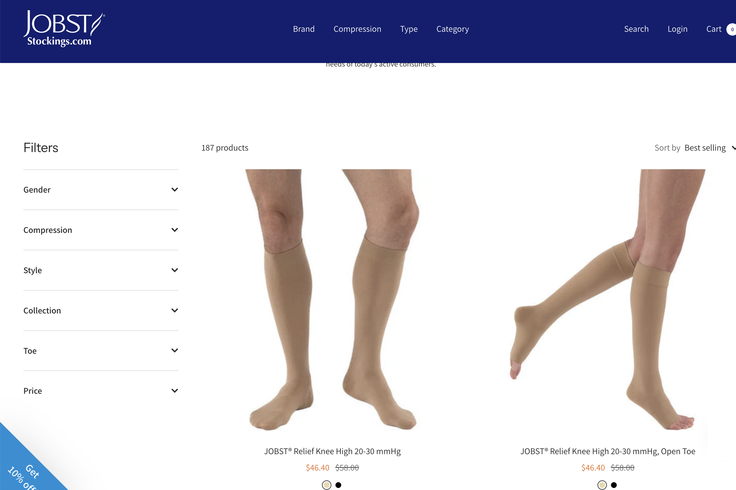
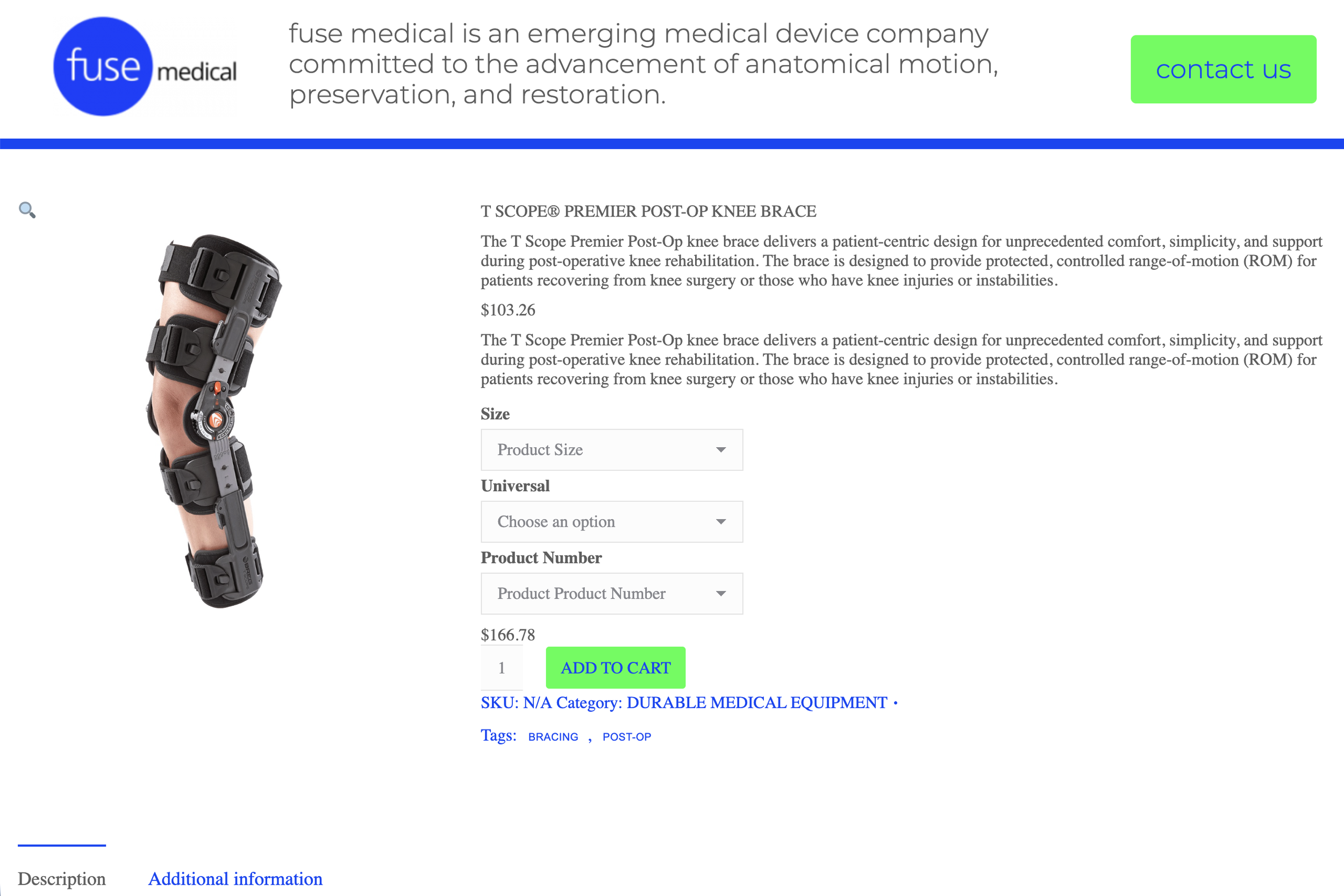
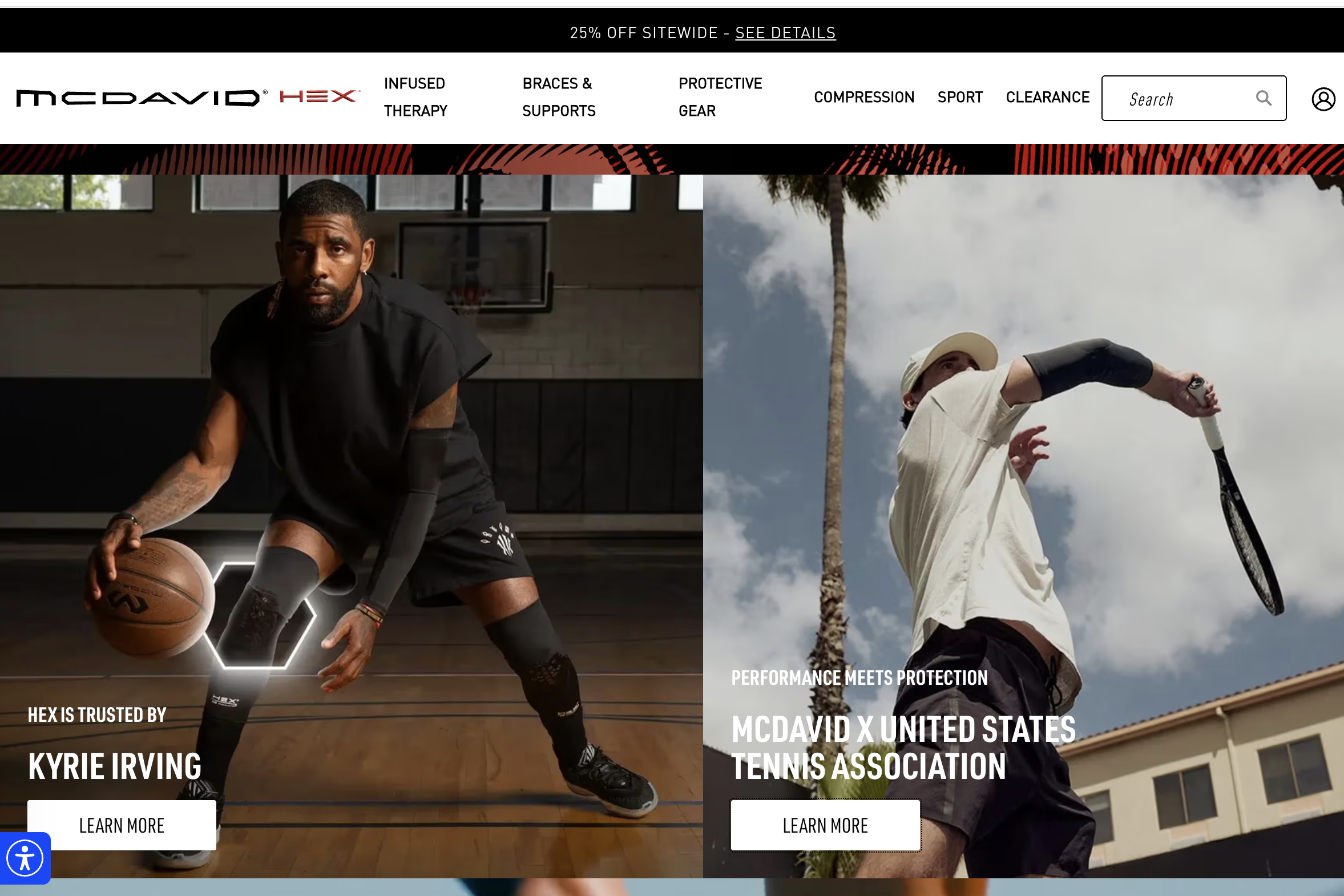
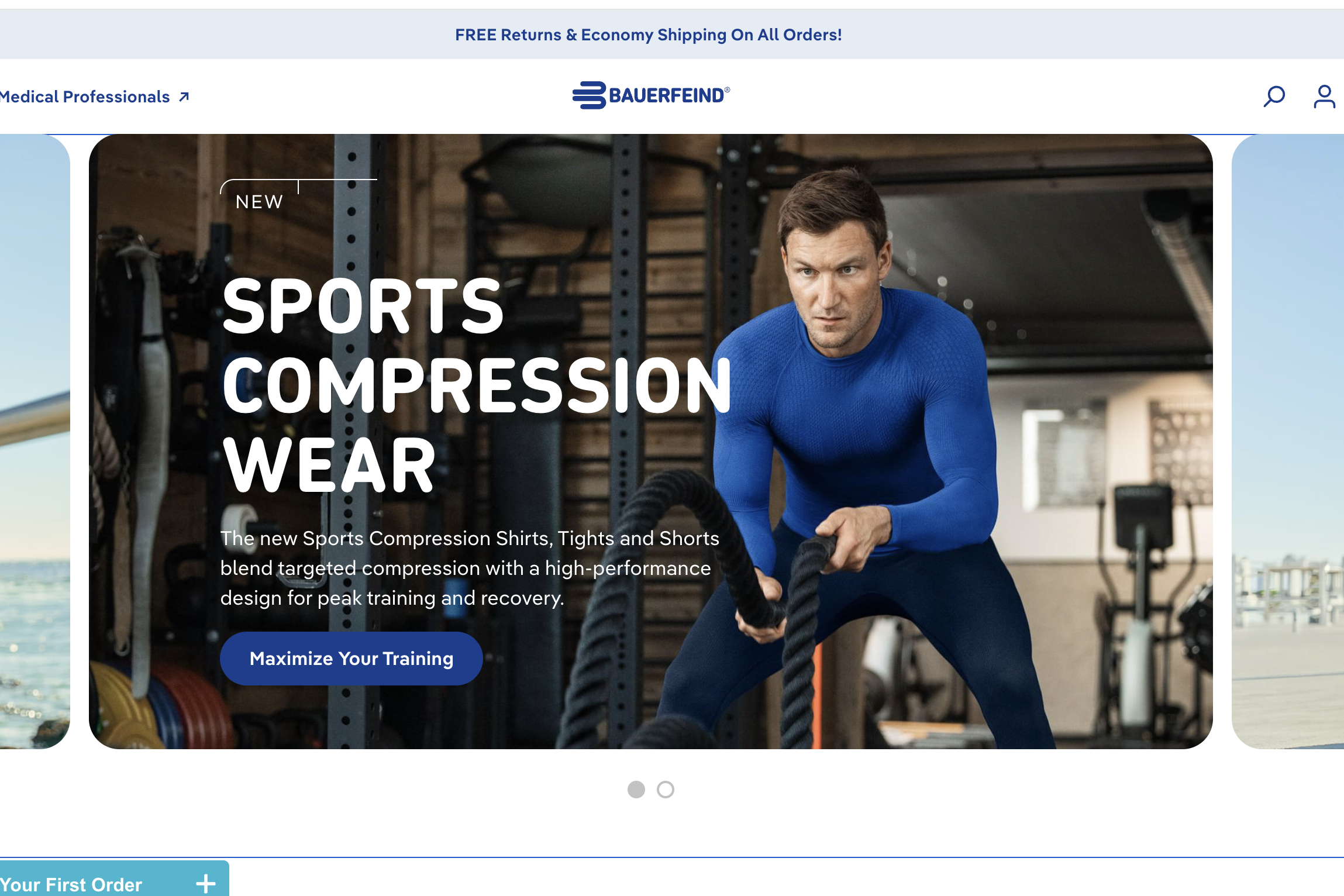
Competitive landscape in orthopedic recovery: Sterile layouts with isolated product shots or sports-focused imagery. Non-athletic patients are represented almost exclusively by older adults.
Revisited Brand Redesign

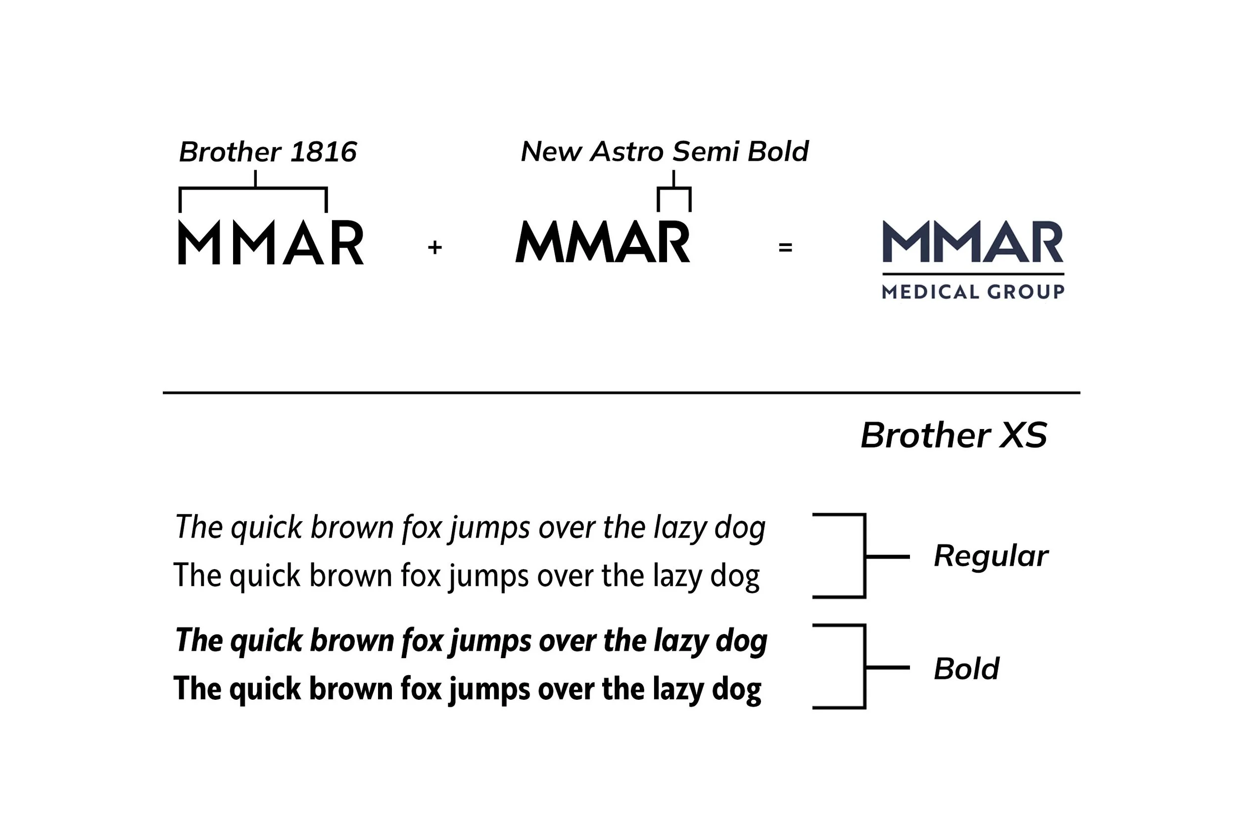


Typography with intention: Brother 1816 was selected for its strong parallel lines and sharp peaks in the M, conveying strength, stability, and confidence. New Astro introduced a futuristic edge to the R, with carefully matched proportions and weights for a cohesive wordmark. Brother XS completed the identity with clean, modern typography optimized for readability.
Revisited Catalog Spreads
I reimagined the 2026 catalog to stand out in a crowded marketplace, whether it landed on the desk of a physical therapist, occupational therapist, or orthopedic specialist, or appeared alongside competitors online. Bold colors, fashion-inspired layouts, and aspirational photography makes MMAR instantly recognizable and memorable. For busy office managers purchasing equipment for patients, the distinctive visual approach helps MMAR stand apart from distributors offering many of the same products, creating brand recognition that could influence future purchasing decisions.